

A practical approach to how to speed up website on mobile starts with finding the actual bottleneck instead of installing optimization tools at random. A site can feel acceptable on a desktop connection and still load slowly on a smartphone because mobile devices, networks, images, scripts, and server response all affect the experience differently. The goal is not simply to make a speed-testing number look better. It is to help visitors see useful content quickly, interact with the page without delays, and move through the site without frustration.
If your mobile site is slow, start by measuring it, identify the largest problem, and fix the highest-impact issue first. This approach is more reliable than changing ten settings at once and then trying to determine which change actually helped.
Why Mobile Website Speed Is Different
Mobile performance is not simply desktop performance displayed on a smaller screen.
A smartphone may have considerably less processing power than a desktop computer. The visitor may also be using a congested Wi-Fi connection or cellular network. At the same time, the browser still has to download images, stylesheets, JavaScript, fonts, analytics scripts, videos, and other resources before the page becomes fully usable.
That combination creates an important distinction: a page can transfer a modest amount of data and still feel slow if the browser has too much work to perform.
For example, imagine a landing page with a large hero image, several animation effects, multiple font files, a slider, a chat widget, analytics, and several third-party marketing scripts. Reducing the hero image may help, but it will not necessarily solve a slow interaction problem if JavaScript is consuming the phone’s CPU.
This is why effective mobile optimization starts with diagnosis.
Start With PageSpeed Insights and Real-World Data
A useful first step is to test the exact page that feels slow rather than testing only the homepage.
Google’s performance ecosystem provides both lab and field measurements. PageSpeed-style testing can reveal potential bottlenecks under controlled conditions, while real-user data can show how actual visitors experience pages over time.
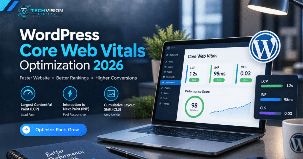
Pay particular attention to Core Web Vitals:
- Largest Contentful Paint (LCP) measures loading performance.
- Interaction to Next Paint (INP) measures responsiveness.
- Cumulative Layout Shift (CLS) measures visual stability.
Google currently recommends an LCP of 2.5 seconds or less, an INP below 200 milliseconds, and a CLS score below 0.1 for a good user experience.
These numbers are useful targets, but they should not become the entire optimization strategy. A page does not become good simply because a testing tool displays a particular score.
Look at what the metrics are telling you.
If LCP is poor, ask what large element is taking too long to appear. If INP is poor, investigate JavaScript and long-running browser tasks. If CLS is poor, look for images, fonts, advertisements, embeds, or other elements that change size after the page begins rendering.
That diagnosis gives you a direction for the next step.
How to Speed Up Website on Mobile by Fixing the Biggest Bottleneck First
There is no universal “mobile speed button.” Different websites slow down for different reasons.
WordPress’s own performance documentation identifies factors such as hosting, themes, plugins, image size, caching, software configuration, and server resources as important contributors to performance.
A useful troubleshooting order is:
- Measure the page
- Identify the largest performance problem
- Optimize large images and media
- Improve caching and delivery
- Reduce unnecessary JavaScript and CSS
- Review third-party scripts
- Check hosting and server response
- Test Core Web Vitals again
This order matters because optimization has diminishing returns.
If a page is sending a 4 MB hero image to a phone, spending an hour fine-tuning a small CSS file is unlikely to produce a meaningful improvement. Likewise, replacing an image may not solve a slow page if the server takes several seconds to begin responding.
Optimize Images for the Actual Mobile Layout to speed up website on mobile
Images are one of the first things worth investigating because they can represent a large portion of the data a browser downloads.
The important question is not simply, “Is this image compressed?”
Ask instead:
Is the visitor receiving an image that is appropriate for the size at which it is actually displayed?
A 2,000-pixel-wide image displayed at 360 pixels on a phone may contain far more data than necessary. WordPress supports responsive image markup using srcset and sizes, allowing browsers to select a more appropriate image resource based on the device and display conditions.
That means you should avoid manually replacing responsive image behavior with a single oversized file whenever possible.
Also consider the format and purpose of each image. Modern formats such as WebP or AVIF can reduce file size, but format conversion alone is not a complete strategy. An unnecessarily large image remains unnecessarily large even when saved in a more efficient format.
For above-the-fold images, be especially careful with lazy loading. The main image that contributes to LCP should not be treated the same way as an image far below the fold.
Do Not Optimize Every Image the Same Way
A product thumbnail, hero image, logo, decorative background, and below-the-fold photograph have different performance roles.
For example:
- A hero image may need priority because it contributes to the initial visual experience.
- A below-the-fold gallery can often load later.
- A small logo should not be delivered as a huge original file.
- A decorative image may sometimes be removed entirely without affecting the content.
The best optimization is occasionally deletion.
If an element does not contribute meaningful information, usability, branding, or conversion value, making it load faster is not as valuable as asking whether it needs to load at all.
Improve Caching and Resource Delivery
Once large images are under control, caching is one of the most useful areas to investigate when learning how to speed up website on mobile.
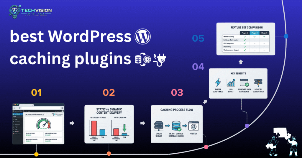
Caching reduces the amount of work required to generate and deliver a page repeatedly. Depending on your setup, this can include browser caching, page caching, object caching, and server-level caching.
For a WordPress site, page caching can be particularly helpful when pages do not need to be generated dynamically for every visitor. Instead of repeatedly processing the same PHP code and database queries, a cached version can often be served more quickly.
But caching is not something to enable blindly.
A poorly configured cache can create problems such as outdated content, broken dynamic functionality, or conflicts with plugins. E-commerce sites require additional care because shopping carts, account pages, checkout processes, and other personalized areas may need different caching behavior.
Use a CDN When It Makes Sense
A content delivery network, or CDN, can distribute static resources through servers located closer to visitors.
This can be useful when your audience is geographically distributed. A visitor in California, for example, may benefit when static assets can be delivered from infrastructure closer to them instead of traveling unnecessarily far from the site’s origin server.
A CDN does not automatically make every website fast.
If the origin server is slow, the HTML is poorly optimized, or the browser has to execute a large amount of JavaScript, putting a CDN in front of the site will not magically eliminate those bottlenecks.
Think of a CDN as part of the delivery system—not a substitute for fixing a poorly optimized website.
Reduce JavaScript That Your Mobile Visitors Do Not Need
JavaScript is another major area to investigate.
Modern websites frequently use JavaScript for menus, sliders, animations, analytics, forms, chat widgets, personalization, consent tools, and other interactive features. Each script may seem reasonable individually, but their combined cost can become significant on a mobile device.
The browser has to download, parse, compile, and execute JavaScript. Heavy main-thread work can delay interactions, which is particularly relevant when investigating poor INP results.
A useful question is:
Does this script need to run immediately for the visitor to use the page?
If the answer is no, consider whether it can be delayed, deferred, loaded only when needed, or removed.
Audit Third-Party Scripts for speed up website on mobile
Third-party resources deserve special attention because they are often outside your website’s core functionality.
Examples include:
- Live-chat widgets
- Advertising scripts
- Social-media embeds
- Heatmaps
- Analytics platforms
- Review widgets
- Tracking pixels
- Appointment tools
- Marketing automation
- Video embeds
Removing every third-party script is not realistic for many businesses. The goal is to understand the trade-off.
If a chat widget generates valuable leads, removing it may not be worthwhile simply because it adds some JavaScript. On the other hand, keeping five different tracking tools that provide almost identical information may create unnecessary performance costs.
Review third-party services based on business value versus performance cost.
That is a much better approach than chasing a perfect laboratory score.
Optimize CSS Without Breaking the Design to speed up website on mobile
CSS normally does not create the same type of CPU workload as large JavaScript bundles, but excessive stylesheets and unnecessary CSS can still contribute to page weight and rendering work.
Common sources include:
- Page-builder-generated CSS
- Unused theme styles
- Plugin styles loaded sitewide
- Large framework libraries
- Duplicate styles
- Unnecessary animation rules
- Multiple design systems added over time
This can become particularly noticeable on websites that have accumulated plugins and design changes over several years.
If you’re using WordPress with a visual builder, do not immediately delete CSS or disable optimization settings one by one on a production site.
First determine which stylesheet or feature is responsible.
An optimization setting that looks harmless can break menus, forms, responsive layouts, sliders, or other interactive components.
Be Careful With Aggressive Minification
Minifying CSS and JavaScript can reduce unnecessary characters such as whitespace and comments. It can be useful, but minification itself is rarely the solution to a severely slow mobile website.
More aggressive optimization techniques—such as combining files, delaying scripts, or changing loading order—can introduce compatibility problems.
After making these changes, test:
- Navigation
- Forms
- Buttons
- Menus
- Pop-ups
- Sliders
- Checkout
- Login functionality
- Mobile layouts
A page that scores well but has a broken checkout is not a successful optimization.
Check Your Hosting and Server Response Time
Sometimes the problem is not primarily on the browser side.
If the server takes too long to respond before the browser can begin receiving the page, image compression and CSS optimization cannot fully compensate.
Hosting performance can be affected by:
- Server resources
- Traffic levels
- Database workload
- Poorly optimized queries
- Plugin activity
- Server configuration
- Geographic distance
- Inadequate hosting resources
This is one reason website speed should be approached as a system rather than as a collection of isolated tricks.
If your site consistently has a slow initial response even after obvious front-end issues have been addressed, investigate the hosting environment and server-side workload.
For WordPress sites, this may involve examining database queries, PHP execution, object caching, hosting resources, and plugin behavior.
Use Mobile-Specific Testing for speed up website on mobile
One of the easiest mistakes is optimizing on a fast desktop computer and assuming the result will translate directly to smartphones.
It may not.
Test important pages under mobile conditions and compare them with desktop results. Look at more than one page type, too.
A useful test set might include:
- Homepage
- Service page
- Blog article
- Contact page
- Product/category page
- Checkout page, if applicable
A homepage may perform well while a blog template contains oversized featured images. An eCommerce category page may perform poorly because it loads dozens of product images and additional scripts.
The goal is to find patterns, not to celebrate one good score.
A Practical Mobile Speed Checklist for WordPress
If you’re using WordPress, how to speed up website on mobile often comes down to controlling how many resources your theme, plugins, page builder, and content require.
WordPress itself provides several performance mechanisms, including responsive images and different forms of caching. Its official documentation also identifies hosting, themes, plugins, image sizes, software configuration, and database performance as factors that can affect overall performance.
Work through the following checklist rather than changing everything simultaneously.
1. Remove Unnecessary Plugins and Features
Plugin count alone does not determine whether a WordPress site is slow. One poorly performing plugin can have a greater impact than several lightweight plugins.
Review plugins that:
- Are no longer being used
- Duplicate functionality
- Load resources across the entire site
- Add unnecessary front-end scripts
- Exist only for a feature that has been removed
The same principle applies to theme features and page-builder widgets.
If your homepage contains five animation effects that contribute little to the visitor’s understanding of the page, removing some of them may be more valuable than trying to optimize the animations individually.
2. Keep Images Responsive
Don’t assume that reducing an image’s CSS dimensions reduces its download size.
A 2,000-pixel image displayed at 400 pixels can still require the browser to download a much larger resource than necessary.
WordPress supports responsive images through srcset and sizes, allowing the browser to select an appropriate source from available image sizes.
When reviewing a slow page, inspect the actual image request rather than looking only at its appearance on the screen.
3. Enable Appropriate Caching
Caching can reduce repeated server processing and improve delivery of frequently requested resources. WordPress documents page caching, browser caching, object caching, and server caching as different approaches with different purposes.
For a relatively static business website, page caching can be especially useful.
For an online store, however, caching must be configured around dynamic functionality. Do not assume that one aggressive caching setting is appropriate for every page.
4. Review Fonts
Fonts are easy to overlook.
A website might load multiple font families, several weights, italics, icon fonts, and external font resources even though visitors only see a small subset of them.
Reduce unnecessary font variations and avoid loading resources that the page does not actually use.
Also make sure text remains readable while fonts are loading. A performance improvement that causes a poor visual experience is not necessarily an improvement.
How to Fix Poor Core Web Vitals on Mobile
Core Web Vitals are particularly useful because they help separate different categories of performance problems.
Poor LCP: Find the Main Content That Loads Too Slowly
If LCP is poor, identify the element reported as the largest contentful element.
It may be:
- A hero image
- A large heading
- A featured image
- A video poster
- A content block
Then investigate the entire path required to display it.
The solution may involve image optimization, server response time, resource prioritization, render-blocking resources, or other loading dependencies. Optimizing only the image may not solve the problem if the server or CSS delays its appearance.
web.dev specifically notes that LCP optimization can involve factors beyond image size, including Time to First Byte and resource load delay.
Poor INP: Look at JavaScript and Interactions
If INP is poor, investigate what happens when users interact with the page.
A mobile visitor might tap a menu button, product filter, form field, or checkout control and experience a noticeable delay.
Large JavaScript tasks can block the browser’s main thread and delay visual updates.
Look for:
- Large JavaScript bundles
- Expensive event handlers
- Unnecessary animations
- Heavy third-party scripts
- Excessive DOM work
- Plugins that add complex front-end behavior
The answer is not always “defer everything.” Interactive functionality still needs to be available when the visitor expects it.
Poor CLS: Stop the Page From Moving
A page that jumps while loading can be frustrating even when its overall loading time is reasonable.
Common causes include images without reserved dimensions, dynamically injected content, advertisements, embeds, and fonts that change the layout after rendering.
Give important visual elements predictable dimensions and test the page on an actual mobile viewport.
The objective is simple: the content should remain where the visitor expects it to be.
Common Mobile Speed Mistakes to Avoid
Some optimization techniques sound attractive but can create new problems.
Installing Multiple Optimization Plugins
More optimization plugins do not necessarily mean more optimization.
Several plugins may attempt to:
- Minify the same files
- Lazy-load the same resources
- Modify JavaScript execution
- Optimize images simultaneously
- Control caching independently
That can create conflicts and make troubleshooting much harder.
Choose a coherent performance strategy and understand what each tool is changing.
Chasing a Perfect PageSpeed Score
A laboratory score is a diagnostic signal, not the business objective.
A page with a high score can still have confusing navigation, poor content, inaccessible controls, or a broken conversion path.
Likewise, a page that does not achieve a perfect score may still provide an excellent experience if its important content loads quickly and interactions remain responsive.
Use performance tools to find problems—not to create arbitrary technical work.
Testing Only the Homepage
Your homepage is only one URL.
Test the pages that matter to your business:
- Landing pages
- Service pages
- Blog posts
- Product pages
- Category pages
- Contact forms
- Checkout pages
Different templates can produce completely different performance results.
When You Should Consider Professional Website Speed Optimization
Some problems are straightforward. Others require deeper technical investigation.
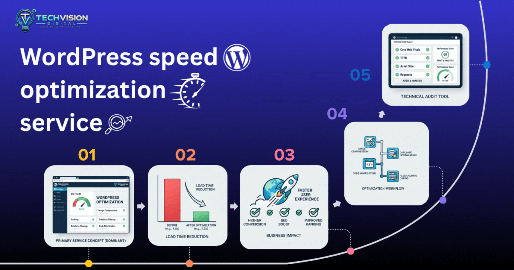
You may be able to handle image compression, plugin cleanup, and basic caching yourself. But if the site continues to perform poorly after obvious fixes, the bottleneck may involve server configuration, database queries, JavaScript execution, theme architecture, third-party resources, or a combination of several issues.
That is where professional performance optimization can make sense.
Instead of applying another generic list of speed settings, a developer can investigate why the page is slow, determine which changes are likely to have the greatest impact, and then test those changes without sacrificing important functionality.
For businesses using WordPress, that can include reviewing the theme, page-builder output, plugins, images, caching configuration, hosting environment, and Core Web Vitals.
Final Takeaway: Speed Up the Experience, Not Just the Score
Learning how to speed up website on mobile is ultimately about reducing unnecessary work for both the server and the visitor’s device.
Start with measurement. Find the largest bottleneck. Then work through the highest-impact improvements: right-sized images, sensible caching, fewer unnecessary scripts, cleaner CSS, appropriate third-party resources, reliable hosting, and Core Web Vitals.
Do not make twenty changes at once. Change one area, test the result, and confirm that the site’s functionality still works.
And remember that speed optimization is not a one-time checkbox. Websites evolve. New plugins, images, tracking tools, design features, and content can gradually add performance costs.
If you need help diagnosing or improving a WordPress site’s performance, TechVision Digital can help evaluate the technical bottlenecks and determine which optimization work is actually worth doing.
Frequently Asked Questions
Why is my website fast on desktop but slow on mobile?
Desktop computers often have more processing power and may use faster connections. Mobile performance can expose problems caused by large images, JavaScript, third-party resources, server response time, or excessive page complexity.
Does a faster hosting plan always make a website faster?
No. Better hosting can help when server resources or response time are the bottleneck, but it will not automatically fix oversized images, excessive JavaScript, inefficient CSS, or unnecessary third-party scripts.
Should I use a caching plugin on WordPress?
Caching can significantly improve performance for many WordPress websites, particularly relatively static pages. However, the configuration should match the site’s functionality. Dynamic features such as shopping carts and personalized content require additional care. (WordPress Developer Resources)
What is the fastest way to improve mobile website speed?
There is no single fix that works for every site. Start by measuring the page and identifying its largest bottleneck. On many sites, oversized images, excessive JavaScript, caching problems, or slow server response are more significant than minor CSS optimizations.
Does improving Core Web Vitals guarantee higher rankings?
No. Improving page experience can benefit users and is part of Google’s broader search systems, but there is no guarantee that achieving a particular performance score will produce a specific ranking outcome.
Conclusion
Learning how to speed up website on mobile is not about applying every optimization technique you can find. It is about identifying what is actually slowing the page down and fixing those problems in the right order.
Start by testing the pages that matter most to your visitors. Check Core Web Vitals and look for issues involving large images, slow server response, excessive JavaScript, unnecessary CSS, third-party scripts, caching, or poorly optimized WordPress resources. From there, prioritize the changes that can make the biggest difference instead of making dozens of small adjustments at once.
Remember that a fast website should also remain functional, accessible, visually stable, and easy to use. Aggressive optimization that breaks a menu, form, checkout process, or mobile layout is not a real performance improvement.
For WordPress websites, ongoing performance monitoring is also important. New plugins, images, tracking tools, page-builder elements, and content can gradually increase page weight over time. A site that performs well today may need another review as it grows.
If your website is still slow after basic optimization, the underlying issue may require a deeper technical review of the hosting environment, theme, plugins, database, JavaScript, caching setup, or Core Web Vitals.
Need help improving a slow WordPress website? TechVision Digital can help identify the real performance bottlenecks and recommend practical improvements without compromising your website’s functionality or user experience.